Digital signage is often seen as a push medium, brands broadcasting messages to people passing by. But when it’s designed thoughtfully, it works differently. Instead of forcing attention, it quietly pulls people in.
The difference usually comes down to design. Screens with cluttered layouts or weak contrast tend to fade into the background. On the other hand, clear structure, strong visuals, and focused messaging naturally guide the viewer’s eye.
And in busy environments, that distinction matters. Airports, malls, offices, and retail spaces are full of competing stimuli. If your message isn’t instantly clear, it simply gets overlooked.
In this post, we’ll walk through 12 digital signage design principles that help your content stand out, improve visibility, and make your message easier to notice and understand.
Design Principles That Make Digital Signage Easier to Notice
Effective digital signage relies on clear visual structure and thoughtful design. When the right elements come together, your message becomes easier to spot, read, and remember. Here are the digital signage design principles that improve visibility:
1. Use Large, Readable Fonts
Many marketing managers try to fit more information on a single screen by shrinking the font size. It may feel efficient, but it often backfires. Smaller text makes signage harder to notice and even harder to read, especially when people are walking past quickly.
Instead of packing the screen, design for quick visibility and easy scanning. A few simple adjustments can make your message far easier to see and understand:
- Think in Viewing Distance, Not Pixels: Size your text based on how far people are from the screen.
- Keep Primary Text Large: Headlines or key messages should typically be 30-40 pt or larger for standard viewing distances.
- Limit the Amount of Text: Short, clear messages are easier for viewers to notice and grasp quickly.
- Avoid Decorative or Script Fonts: Stylish fonts often reduce readability on digital screens.
- Test from a Distance: If someone has to squint, the message is already lost.
2. Maintain Strong Color Contrast
Contrast determines whether text is readable or invisible, especially in bright environments like retail floors, lobbies, or outdoor displays. Low-contrast combinations, such as gray on white or dark blue on black, quickly lose visibility when ambient light competes with the screen.
Use strong color pairs, such as white on dark backgrounds or black on yellow, to keep text clear. The WCAG 4.5:1 contrast ratio is a useful benchmark to ensure readability, even when lighting conditions or screen brightness change.
3. Limit Words Per Slide
Most people glance at digital signage for only 3–5 seconds. Yet many screens are written like brochures, filled with long sentences and dense information. When a slide contains too much text, it quickly becomes visual clutter, and the message gets ignored.
Instead, write like you’re creating headlines, not paragraphs. A simple guideline is the 5×5 rule: no more than 5 words per line and 5 lines per slide. Keeping text short gives the design space to breathe and makes the message easier to notice and grasp quickly.
4. Prioritize Motion Strategically
Motion naturally attracts attention, but too much of it can quickly work against you. Because people instinctively notice movement, animation can help guide focus on a screen when used with care.
Subtle entrance effects, slow background motion like a gentle zoom or parallax, and transitions that match your brand’s pace can smoothly guide the viewer’s eye from one element to the next. In contrast, flashing visuals, rapid cuts, or constantly looping animations often become distracting.
5. Keep Layout Clean and Structured
A cluttered layout forces the brain to process too many choices at once. In fast-moving environments, that usually means the viewer disengages. Clean layouts make the message easier to scan and understand at a glance.
Focus on a few essentials:
- Use white space intentionally to separate elements and improve readability.
- Create clear visual zones for the logo, headline, and supporting content or CTA.
- Keep alignment consistent and use grids to maintain structure.
When the layout is organized, the design does the cognitive work for the viewer.
6. Design for Viewing Distance
Digital signage is often viewed from 10-20 feet away, making readability at a distance critical. Text or details that seem clear up close can become hard to read when someone is walking past the screen.
A simple rule helps: multiply the viewing distance (in feet) by 8 to estimate the minimum font size in pixels. For example, a screen viewed from 10 feet should use text at least 80px. It also helps to step back and review the content from the expected viewing distance, since screen size, resolution, and mounting height can affect how easily the message is seen.
7. Use Hierarchy for Messaging
Messaging hierarchy determines what the viewer notices first, second, and third. Without it, every element competes for attention, and the message becomes harder to process.
A simple three-tier structure works well:
- Primary message
- Supporting context
- Call to action
The headline should be the most prominent element, followed by smaller supporting text. The CTA should stand out without competing with the headline. Each level should be clear at a glance so viewers can grasp the message within seconds.
9. Optimize for Screen Orientation
Landscape and portrait displays are not interchangeable, yet content designed for one is often used on the other. This can lead to awkward layouts or poorly balanced visuals.
Landscape works best for most commercial displays, while portrait formats suit elevators, narrow retail aisles, and wayfinding kiosks. Always design specifically for the screen’s orientation. If your network uses both, maintain separate templates and use CMS tools to schedule orientation-specific content.
10. Use High-Resolution Media
Large commercial displays quickly expose low-resolution visuals. Pixelated edges, muddy gradients, or stretched images make content look unpolished and can weaken brand perception.
As a baseline, 1080p is the minimum for most signage screens, while many newer displays support 4K. Avoid stretching web-sized images onto large screens, use high-quality source files (300 DPI or higher), and export videos at the correct resolution and aspect ratio before uploading, rather than relying on the player to scale them.
11. Keep Branding Consistent
People rarely stop to watch a digital signage screen for long. Most are walking past, glancing briefly, or dividing their attention. That means your message needs to land quickly, within about 5-8 seconds.
A few simple practices help:
- Focus on one message per slide. Avoid crowding multiple ideas on the same screen.
- Rotate messages instead of stacking them. Multiple slides are easier to process than one dense layout.
- Plan the flow across slides: awareness → detail → CTA.
Most importantly, assume the viewer may only see one slide. Each screen should communicate a clear, complete message on its own.
12. Test Before Deployment
What looks good in design software doesn’t always appear the same on the actual display. Color accuracy, font rendering, animation timing, and aspect ratios can behave differently once content is deployed. Testing acts as the final quality check before screens go live.
A few simple steps make testing more reliable:
- Preview content on the actual display (or the same model) whenever possible.
- Review from the real viewing distance and under typical lighting conditions.
- Check animations at full playback speed and review the entire content loop, not just individual slides.
- For multi-screen networks, spot-check multiple displays to ensure consistency.
Many CMS platforms also support remote previews and test deployments, which can help validate content before rolling it out across the network.
Conclusion
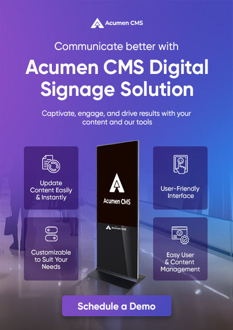
Visibility is what separates digital signage that drives results from screens that get ignored. These principles give your content the best chance of being noticed, read, and acted on, but design is only half the equation.
You also need a platform that makes execution seamless.
Acumen CMS lets you manage, schedule, and update content across multiple screens from a single dashboard, so your messaging always reaches the right screen at the right time.